
Note! These instructions do not apply to the latest versions of Elementor, which includes an out-of-the-box Content Order system.
View information here: https://elementor.com/help/advanced-widget-settings-order/
Old versions of Elementor only provides the ability to “Reverse” columns in a Section when on Tablet, or Mobile view…
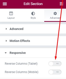
Although, this doesn’t really help when you have a few columns, and might want to show only the last one first or the middle one last on mobile etc.
This is a where the following Code Snippet will help. It adds an extra option to Columns to define in which position you want it for a particular Responsive view.
Install the Code Snippets Plugin
First – if you don’t already have the code snippets plugin – you’ll need to install it. Go to Plugins > Add New > and Search for “code snippets” > then click ‘Install Now’ for the Code Snippets in search results. Then Click “Activate” once installed.

Now you can go to Snippets > Add New > Give it a title like “Custom Column Ordering”.
In the ‘Code’ section you’ll paste the code below:
					function snug_custom_order( $element, $args ) {
	$element->add_responsive_control(
		'responsive_column_order',
		[
			'label' => __( 'Responsive Column Order', 'snug-elementor-extra' ),
			'type' => \Elementor\Controls_Manager::NUMBER,
			'separator' => 'before',
			'selectors' => [
				'{{WRAPPER}}' => '-webkit-order: {{VALUE}}; -ms-flex-order: {{VALUE}}; order: {{VALUE}};',
			],
		]
	);
}
add_action( 'elementor/element/column/layout/before_section_end', 'snug_custom_order', 10, 2 );
How to use the Elementor Custom Column Ordering
When you edit a Column, you’ll find an extra option for adjusting the Column Order…
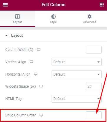
This will work for each Responsive option, you can switch to a “Mobile” responsive view, and the Column Order will only affect that size. Note that smaller responsive sizes always inherit from larger sizes, unless overridden in the smaller size.