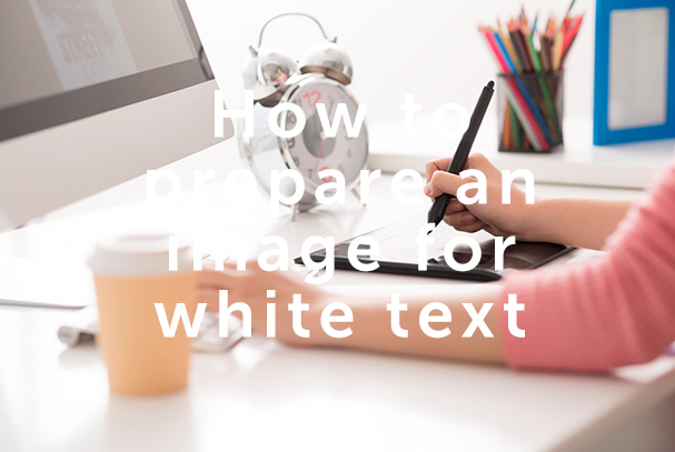

How to prepare an image for white text
Step 1: Lens Blur
This may not be required with most images. The concept here is that a background image should not appear as clear as the foreground font (especially important if there is any background font). The image will appear out-of-focus, giving the impression that it’s in the background, behind the text.
Select Filter > Blur > Lens Blur…
You can use the default settings – but ensure you retain the recognisability of the image and distinct elements within the image.
Here I used a ‘Radius’ of 8.

Step 2: Black and White
To prepare the image for colourisation, we will first make it Black and White. Default options are typically fine here, however advanced manipulation of the options could achieve better results.
Select Layer > New Adjustment Layer > Black and White…

Step 3: Photo Filter
Now we want to colourise the image.
Select Layer > New Adjustment Layer > Photo Filter…
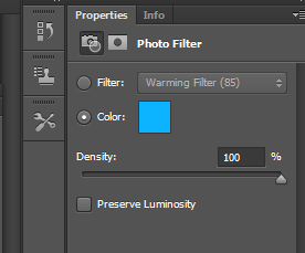
Under the Photo Filter Properties you will want to change from ‘filter’ to ‘color’
Ensure that ‘Density’ is up to 100%
Now choose your colour: (I went with #00b4ff) – Ensure your colour isn’t too dark or too light.

Step 4: Curves
The image above looks good – except for a few dark areas that are creating some contrast, which causes the eye to dart around the lettering a little bit. This can be cured by making the darker areas lighter.
Select Layer > New Adjusment Layer > Curves…
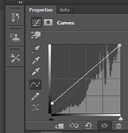
You will want to play around with these curves until you achieve maximum readability. To lighten the dark spots, drag the lower left corner of the curve matrix upwards. This may require some experimentation, the aim is to increase readability, and not obfuscation of the image, ensure the image is still recognisable.