Introduction
Website Design today is all about keeping it clean, discreet, easy to explore, and to the point. Less is more. This is in part due to the viewing demands of our diminishing screen sizes (smart phones) – although, mainly due to a better understanding of how people digest and experience information.
Web design is always on the move, and some of the current concepts shared by the web design community will give way to other design trends in time. However, due to the nature and significance of this recent paradigm shift – I foresee many of the current style standards to be with us for a long time.
In the early days of Web Design, we were all trying too hard. We added sparkling text and animated glowing buttons because we could. It was an over-compensation. We integrated superfluous embellishments and graphical effects as a way to show our competence and abilities. Website owners were always looking for the latest irrational novelty to represent their individuality.
Design has changed a lot over the years. Web Designers have perhaps begun to understand that good design is not all about how pretty something looks, but how well it functions. There is also an incredible consideration now for how information is experienced.
To show our skill as web designers now, we implement ease of use, and sensible style that doesn’t obstruct good information. The way a website looks, should represent a brand or message, as opposed to adding special effects and glitter for the sake of it.
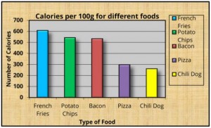
Here is a visual analogy of how web design has changed over the years:
Early Websites
Modern Websites

The “Early Websites” image shows that through an attempt to make a graph look good – by adding many colours, shadows and a tiled background – it has generated an end result that is a cluttered and distracting monstrosity.
The “Modern Websites” image shows a graph which contains all of the information we require. By stripping the unnecessary elements, we are left with something that looks much better.
The funny thing is: modern, clean, and accessible web design was possible in the early days of the internet. Yet we were distracted by the advancement of the visuals that faster bandwidth and inventive media brought. It has taken us over a decade to truly get into the crux of intelligent design choices. Choices that consider the emotional effect that design has on a website visitor.
In the old days, a website visitor was happy to open a web page, then sit back and watch a slide-show, read a scrolling marquee, and smile at an amusing animated GIF. However, the novelty of the internet and having a website to visit has worn off.
Today, a person is spoilt for choice when is comes to browsing the internet on any topic. The best way to captivate an audience is with immediately engaging information.
Flat Design and Simplicity
Flat Design is a type of stylistic minimalism that emphasises and embraces usability and simplicity. This style has been popularised by the new Windows 8 and iOS7 interfaces. Information is no presented in a straightforward and sparsely organised fashion. Whitespace is used to direct a viewers focus on the principle substance.
Before the popularity of Flat Design, we once enjoyed the experience of clicking on buttons which looked like physical buttons, and sliding realistic looking levers. Now with a digitally familiar generation of web users; we have shunned the skeumorphism of the past – We have thrown out the gloss, shadow, and texture that casts a thick fog over our web browsing experience. Websites today focus more on the use of color, typography, and layout to enrich a visitors time on a website.
Flat Design also has its benefits beyond style. It can contributes to increased page speed. Many of the graphical elements in Flat Design can be created purely using code, No need to use illustrated images for buttons, menus and other elements. Flat Design increases versatility too – A simple logo, and style motifs can be easily translated and applied across multiple forms of media.
The keys to Flat Design are:
- Only very subtle effects that add depth, realism or movement to a design.
- Plenty of whitespace.
- Simple shapes like rectangles and circles for the elements that make up the site (buttons, logos, menu items, and tables).
- Flat Typography. Avoid adding shadow, bezel, gloss and glow effects to Font.
- Measured approach to the use of colour (See Below).
Colour
Simple colour schemes are one the most distinctive features of the modern website. Most websites are opting for only one or two colour hues across their whole site. This contributes to brand recognition, and is easy on the eyes. Web designers are also beginning to value the psychological effect of colour. If a colour gives you the appropriate emotional response for your brand – then it will likely give this sub-concious response to most of your website visitors.
Any colour is fine. However, there is a colour sweet-spot – somewhere between Pastel and Bold. This can be measured in HSB (Hue, Saturation and Brightness). Any Hue is Fine. Saturation should be between 30% and 90% and Brightness should not fall below 60%.
Somewhere within the Red box on this typical colour selector is best:
This is a crude way of summing up the general colour choices of modern websites. This avoids the stark colours of the old 16 or 256 colour palette of yesterday, and also avoids using anything too dull or dark (taking into consideration the possible negative emotional response that a dim colour brings).
The most important factor though – is to use a Solid colour, and use it boldly. Don’t add shading, gradient or shadow effects to a colourful element. This includes rounding the corners of an element – Square corners increase the confidence of a colour. A solid, bold colour is timeless.
Backgrounds
You have two choices: Solid or None.
Solid: If you must have the width of your website contained within the page, then it’s best to leave the background a solid colour. This usually comes down to White or Black, whichever represents your personality best. However, a shade of colour that represents your brand is also a good option.
As our tastes in website design matures, it’s becoming increasingly difficult to find a Background image, or pattern that looks good. Something is just a little odd these days with having a website floating above a distracting back-drop. The benefit of using a single solid colour is that it frames the content, bringing it into the foreground and containing it in a space that is easy for the eyes to peruse.
None: This is my recommended choice. Websites should be full screen. Backgrounds are then used across the whole page to break up a page into sections. These are called “Bands” or “Stripes” and are the hallmark of a modern website. By having a full-screen website, you will also ensure that the design is consistent across large screens and mobile devices.
Font and Headings
Typography is a big part of website design today – and there is a lot of variation and experimentation going on with font choice. One of the best ways to choose a font, is to simply find a font that you like on another website, discover what the font is by using an online font recognition tool, or taking a look at the websites source code.
Use your font choice consistently throughout your website. However, use a different font for your headings (and sometimes a different colour). This is a good way to guide a visitor to various sections of your site. Headings will also become Dividers, breaking up long tracts of text. Use a bold, easy to read font for your Headings. The most popular font of choice these days is definitely Museo-Sans. Do not use a Full-Stop at the end of a Heading.
Banners vs Large Intro
Website Banners have become a simple affair (referring to the old method of putting a large bar at the top of the screen which contained your Company Name and an image or two). These days a simple Logo in the top left corner will suffice, and the Menu can be integrated nearby – Using the available space to maximum effect. This is due to mobile phone browsing, but also represents the new understanding that an immediate distraction is not what the eyes look for when arriving at a website. The eyes first look for relevant information at the request of the impatient brain. Where am I? Where is the information I’m looking for? Is this the right website to get this information?
Your websites home page is like the cover of a book. It will be mercilessly judged, and only if a visitor likes what they see, will they open the cover to read more.
This is where the “Large Intro” has come into vogue. This is an area that takes up a majority of the Home Page that contains a large image and only a sentence or two of text. When done correctly, this can deliver a huge impact. This is a great way to show the visitor with imagery and a few words exactly what you do, while instantly stapling your site into their memory.
Sounds and Music
Blanket rule: No sound effects on your website.
This was something that was amazing one day and then very annoying the next. Do not set your website to play music automatically. This is the best way to have someone quickly leave your website, and probably not return out of spite of the unwanted interruption to their lives. If you want to provide a video on your homepage, do not set it to auto-play. Often the sudden bombardment of unwanted noise will have a visitor close web pages indiscriminately until the culprit is silenced.
This concludes Part 1 of the “Modern Website Design Guide”. Be sure to join our Google Page for notification of future blog releases.