Introduction
At Snug Site, our focus has always been on what’s best for our clients and the people who visit their websites. While we have immense respect for established design frameworks, we’ve also seen the value in adding our own thoughtful touch. That’s where our concept of the “Action Colour” comes into play.
The Action Colour is a single, distinct colour used exclusively on interactive elements of a website, such as links and buttons. This visual cue helps users understand what elements on the site are interactive and can be clicked on. When multiple elements and actions populate a webpage, the Action Colour will help i instill structure and hierarchy, ensuring a user-first experience. The Action Colour serves as a beacon, guiding attention by making interactive elements distinct from other parts of the screen. This not only enhances user engagement but also ensures that the interactive elements are easily identifiable and intuitive to use.
Choosing the Right Action Colour
The Action Colour isn’t a one-size-fits-all hue; instead, it’s tailored to each client, typically derived from their branding or logo. This ensures that the interactive elements not only stand out but also resonate with the brand’s identity. Action Colour in website design is a simple yet powerful way to enhance the user experience and should not be overlooked.
Selecting the perfect Action Colour is a blend of aesthetics and functionality. Here’s our approach:
- Brand Resonance: We start by looking at our client’s branding, especially the logo. This colour often becomes the primary candidate for the Snug Action Colour as it ensures brand consistency.
- Adaptability: Sometimes, the primary brand colour might not be suitable for all backgrounds or surfaces. In such cases, it’s essential to choose slight shade variations of the same colour. For instance, if a colour doesn’t pop on white or black backgrounds, or if it’s too similar to other tonal surfaces, we’ll adjust its shade while ensuring it remains in the same colour family. This ensures visibility without compromising brand identity. You might want to lean on a design system like “Material Design 3” to find your Action Colour: https://m3.material.io/theme-builder#/custom (Tip: Put your Brand Colour as the Primary and see what comes out).
- Testing: Before finalizing, we test the chosen Snug Action Colour across various design elements and backgrounds to ensure it’s both visually appealing and functional.
Why We Advocate for the Action Colour
- User-Centric Design: The Action Colour helps users effortlessly identify interactive elements. It’s a subtle yet effective way to streamline the browsing process.
- Infusing Brand Personality: Beyond functionality, the Action Colour also adds a touch of our client’s brand essence. It’s a gentle way to reinforce identity and values.
- Embracing Accessibility: Using Action Colour can help those who have colour blindness or visual impairments. A consistent colour for interactive elements aids in making their browsing journey more inclusive and enjoyable. btw, can use a website like: https://www.whocanuse.com/ to test your colour choice.
Example of Elements that should use the Action Colour
- Buttons (e.g. “Read More”, “Submit”, “Add to Cart”)
- Text Links
- Form field Borders (e.g. “Name”, “Phone” in a Contact Form)
- CTA (Call to Action) elements if the entire CTA can be clicked.
- Tabs and Accordions
- Mobile Menu Toggle (The Hamburger Menu)
- Social media icons and sharing buttons
- Pagination buttons (e.g. “Next”, “Previous”)
- User profile and account settings buttons
This is not an exhaustive list and other elements may also benefit from using an Action Colour. The key is to use the colour consistently for all interactive elements, and never use it for non-interactive, or style points (eg background and borders etc.) So users can quickly and easily identify them.
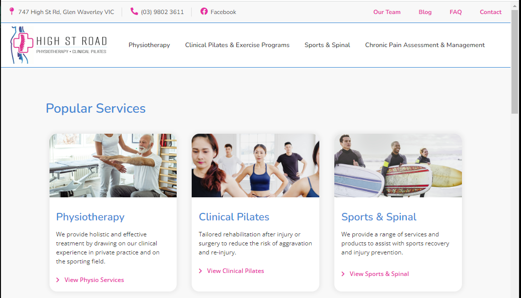
Visual example of good Action Colour usage:
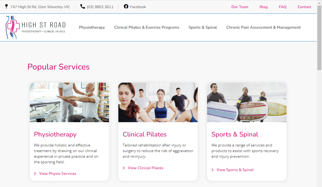
Visual example of bad Action colour usage:
What about the Main Menu?
Frankly, the Main Menu just doesn’t typically look good when using an Action Colour.
Also, the Main Menu serves a different purpose than other interactive elements on the site, it’s a distinct navigation tool that helps users find the content they are looking for, and it is typically displayed prominently at the top of the page. So, in a way, not using an Action Colour here helps to distinguish it from other interactive elements and reinforces its function as a navigation tool. Black text is a common choice for the main menu as it is legible and does not draw too much attention away from the other content on the page.
What about the Footer?
The Footer of a website can often be a source of confusion for users, as it’s not always clear what elements are clickable and what are not. This is often because of design choices that make the Footer look cohesive, such as giving it a solid background color and contrasting text. For instance, navigation links and menu titles may be the same color, or the Privacy Policy link and copyright notice may share a colour, making it difficult to differentiate between interactive and non-interactive elements.
To improve the user experience, it’s recommended to make the Footer background the Action Color and use high contrast colors for interactive elements and a more muted color for other elements. This creates a clear visual hierarchy and helps users understand what elements on the page are interactive and can be clicked on. By paying attention to the Action Color in the Footer, you can ensure that your website’s design is both visually appealing and user-friendly.
Incorporating Action Colour into the Logo
Incorporating the Action Colour into the logo can bring additional benefits to the website. Firstly, it reinforces the brand identity by tying the logo and the site together with a common visual element. Secondly, it makes it easier for users to identify the logo and associate it with the brand.
We often suggest to new website design clients that the Action Colour be taken from within their existing logo. In addition to reinforcing the brand identity, using the Action Colour from the logo can also provide a clear way for users to return to the home screen. By clicking on the logo, users can quickly and easily navigate back to the main page, improving the overall user experience.
Hick’s Law and The Von Restorff Effect.
Hick’s Law states that the time it takes for a person to make a decision increases with the number of options available. In the context of website design, this means that having too many options or elements on a page can slow down the user’s decision-making process and lead to frustration.
By using an Action Colour for only the interactive elements on a website, the user can quickly and easily identify what is clickable and what is not. This clear distinction reduces the number of possibilities the user has to consider and can lead to faster decision-making..
The Von Restorff Effect refers to the phenomenon where items that stand out from their surroundings are more likely to be remembered and attended to. This effect can be applied to website design by using an Action Colour to make interactive elements stand out and be more easily noticeable to the user.
Also note the “Aesthetic-Usability Effect” – which states that a more aesthetically pleasing design can improve the usability of a product. In the context of website design, this means that a website that looks good is more likely to be used and have a better overall user experience. An Action Colour can contribute to the aesthetic appeal of a website, things just have a more cohesive and polished look.
Conclusion:
Here’s an anecdote about the pitfalls of not using an Action Colour:
We had a business come to us, as the website “Just didn’t work!”, they constantly had people calling them, who were excited to get started with the service, but needed guidance to book online, find information, log into accounts, download invoices etc. And some people just preferred to call the business to get things done, rather than attempt it themselves on the website.
The business was spending much more time on the phone, and in support emails than they needed to.
I took one look at the site and could immediately see why… it was a kaleidoscope of seemingly randomly chosen colours for each heading and button. We implemented the Action Colour theory, which resulted in much less phone calls over time. Don’t make your website a whack-a-mole luck based click-frenzy.