Introduction
The main menu is a crucial aspect of web design as it is the primary navigation tool for visitors. This article will focus on how to make the most of the main menu by including only your Key Services or Areas of Expertise. A well-designed main menu can improve user experience and increase conversions, and I’ll provide tips on what to include and what to avoid.
Why key services or areas of expertise should be in the main menu
The main menu is a website’s first impression on visitors and it should clearly communicate what services and offerings are available. Avoid the need for multiple clicks and menus by prominently displaying key services and areas of expertise on the main menu. Visitors shouldn’t have to navigate through multiple pages and menus to discover what it is you do. Immediately educate visitors and show them that they have arrived at the right business. By highlighting these offerings, visitors may even discover additional services they weren’t aware they needed.
A visual Example:
Bad Menu:

Good Menu:

By including only key services and areas of expertise in the main menu, visitors can quickly and easily navigate to what they came looking for. Visitors get a better experience that is more likely to convert them into customers. A Main Menu can help a visitor find what they want to know and make a decision about your business more quickly, which increases the chances of them making a purchase or using your services.
Including other sections such as “About,” “Testimonials” and “Blog” in the main menu can be overwhelming for visitors who just want to know if you provide the services that they are looking for. Keep it simple! Avoid cluttering it with too many options and stick to the most important services and areas of expertise. If you have Sub-Categories for your core offerings, these can be placed as contextual drop-downs on the Main Menu.
Use clear labels: The labels on the main menu should be clear and self-explanatory. Visitors should be able to understand the purpose of each service item at a glance.
This also applies to Online Store Categories.
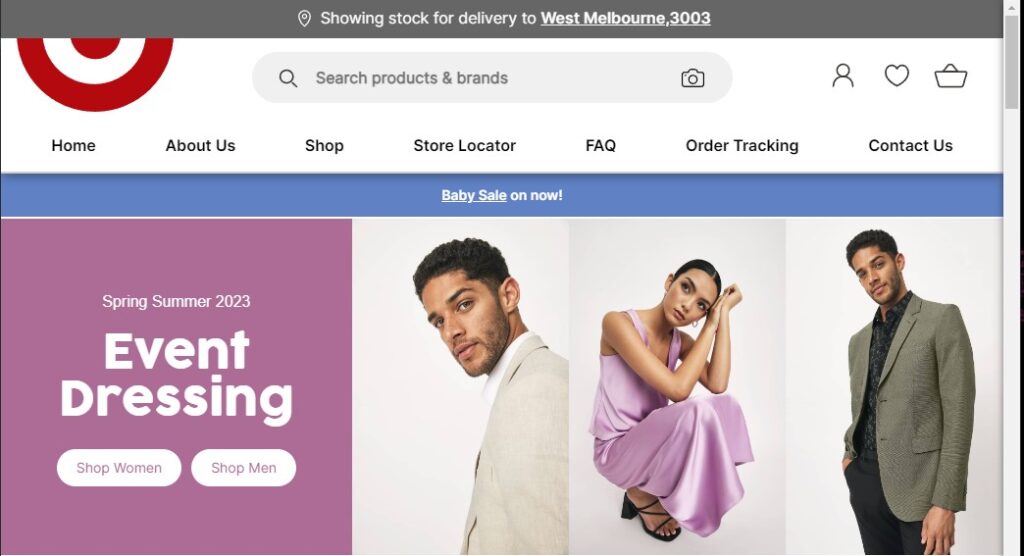
For example target.com.au does not have the following as their Main Menu:

They instead, have the main Menu set out like this:

This is not just helping shoppers know what’s on offer, it also reduces the number of clicks needed to get within each category.
Any Exceptions?
Of course, every site is different. There might be some important things you’d like to add to the Main Menu to improve the site flow. But, this should still be things that people have come there to “do”. Like a Call to Action to ‘Become a Member’, A link to ‘Free Tools’, a ‘Log in button’ (if you have space) etc.
What not to include in the main menu
While it is important to include key services and areas of expertise in the main menu, it is equally important to know what not to include. Common sections that should not be included in the main menu include:
ABOUT: If a visitor really wants to know more about your business and history, they’ll gladly scroll to the footer to find the link. You should be providing enough key information around the site about the business anyway.
CONTACT: Unless you have customers that Contact you frequently, or offer some Support Line… It’s a bit presumptuous to assume that people are going to click on this menu item without first browsing the site a bit, and learning more about you. If they decide to contact you, they’ll ring the number in the footer, or find a link to you Contact page.
BLOG: Blogging is a great way to provide valuable information to visitors, but it’s not a primary service or area of expertise. A link to your Blog can be included in your Footer.
FAQ: Frequently Asked Questions pages are often filled with detailed information that may not be relevant to all visitors. While it can be helpful to have an FAQ page, it’s not necessary to include it in the main menu. Web Designers also have a rule of thumb here… if you are including an FAQ on the site, it just means you have failed to provide relevant key information where and when it is actually needed.
HOME: This is a contentious one; We tell people all the time not to include it, but they insist on having it. While it may seem obvious to include a “Home” menu item, it’s not necessary as the logo typically acts as a link to the Home page. Additionally, including a “Home” menu item can take up valuable real-estate that could be used for more important items.
TESTIMONIALS: Testimonials are a great way to showcase customer satisfaction, but they shouldn’t be one of the most important pages on a site. If someone needs more convincing, they’ll find the Testimonials page (You should have Testimonials scatters around the site, instead of a page anyway).
By not including these sections in the main menu, it allows visitors to focus on the key services and areas of expertise offered by a business, which improves their overall user experience and increases the chances of them converting into customers.
Then where do I put those things?!
You can place these “Particulars” in the Footer, or in a “Particlars Menu” at the top of the site… for example, Here is a lovely one we made for vagtc.org,au

Note that it also includes a cart and search box, and we have left a couple of CTAs in the Main Menu.
Bonus Tip
With the increasing number of users accessing websites on mobile devices, it’s important to ensure that the main menu is responsive and works well on all screen sizes. However, we think it’s a good idea to actually avoid using a “Mobile Menu” if possible, and keep the Main Menu/Key Offerings visible on smaller screens without having to Toggle the menu with a hamburger Menu (ie. don’t switch to Mobile Menu mode on smaller screens if at all possible).
Conclusion
It’s important to include only key services or areas of expertise in the main menu, not only for humans but for SEO purposes too (topic covered in our Content SEO Article). Remember that the main menu is often the first thing that visitors see when they arrive on a website. By following the tips mentioned above, businesses can ensure that their main menu is effective at conveying the key aspects of their business. We encourage readers to implement these tips when designing their main menu.


