Shopping cart abandonment is likely one of the biggest challenges that you could face as an online retailer. The average abandonment rate is a staggering 88% across e-commerce sites. That means for every 100 shoppers who add items to their cart, only 12 actually complete the purchase.
While retargeting campaigns (See our recommendations for Abandoned Cart Recovery plugins) can help recover some of those lost sales, the best strategy is preventing abandonment in the first place. By optimising your checkout flow and using psychological principles, you can drastically reduce cart abandonment and increase conversions.
In this guide, we’ll give you some quickfire tips and design tactics to create a checkout experience that overcomes the main reasons for abandonment.
Streamline the Checkout Process
A complicated, drawn-out checkout is a surefire way to drive customers away before they can complete their purchase. Remove all unnecessary friction:
Offer Guest Checkout
Forcing customers to create an account is a major turnoff. Provide a guest checkout option so first-time buyers don’t have to go through an extra registration step.
In WooCommerce, this can be activated in WooCommerce > Settings > Account & Privacy tab
Optimise the Checkout Form Fields
Only ask for essential information like email, shipping, and payment details. Eliminate any unnecessary form fields that create extra work for the customer.
You might also want to ensure that you are not using the standard form labels for the USA in Australia. Being an Australian customer on an Australian Online store, and seeing fields for “County, Zip Code” is a bit off-putting. See our recommended plugins for WooCommerce Checkout Field Editing.
A Visual Push
Include product thumbnails and a mini cart preview throughout the checkout steps. This reminds customers what’s in their cart and provides a visual enticement to completing the purchase. Menu Cart is a feature available in Elementor Pro: https://elementor.com/help/menu-cart-widget-pro/
Cart and Checkout Page Design
This might seem obvious, but having crappy looking cart and checkout pages won’t do much to help alleviate any concerns from a customer. If your cart and checkout are using colours that are not aligned with your brand colours, or different Action Colours for buttons etc. could trigger doubts about the legitimacy and safety of the site.
Ensure you play around with Style tab in Elementor Pro Cart and Checkout Widgets, as they don’t seem to automatically adapt to your Theme / Global Colours.
More info:
https://elementor.com/help/woocommerce-cart-widget
https://elementor.com/help/woocommerce-checkout-widget
Cater to Different Shopper Motivations
While an optimised checkout flow will reduce abandonments, some shoppers use the cart for different purposes beyond just transactions. Recognising these motivations allows you to adapt your approach.
For “Researchers”
Some shoppers use the cart as an organisational tool or wishlist to compare products, track total costs including shipping, or plan potential purchases. For these users:
- Offer a dedicated wishlist or “save for later” function separate from the shopping cart
- Allow them to easily share/send wishlists to get input from others
- Set up a Back in Stock Notifier plugin like this: https://wordpress.org/plugins/back-in-stock-notifier-for-woocommerce as you might not be the only store that stocks that item, but you might be the only one that can tell the customer as soon as it becomes available.
(See our Recommendation for a Wishlist Plugin)
For “Entertainment Shoppers”
A small percentage of visitors view shopping recreationally, adding items to their cart just for fun without intent to purchase. Prioritise an engaging experience as you may as well give them something to remember you when they are ready to entertain the idea of actually buying something.
- Invest in quality product videos/photography to captivate visitors
- Feature user-generated content to nurture brand affinity (Success stories, Reviews)
- Provide a low-friction way to save interesting items without commitment
- Offer something more than just shopping, like links to a social page, community events or initiatives.
An entertainment shopper can still develop brand loyalty even if not purchasing initially.
For “Price Trackers”
Cost-conscious shoppers may add items to monitor for price drops before pulling the trigger. Build pricing transparency and overcome hesitation.
Shoppers can fret about missing out on a better deal elsewhere. “Maybe I should just go and have a look around at other sites, first”.
Implement a price guarantee to overcome this hurdle. A price guarantee is an offer to match or beat any competitor’s lower price on the same product. Studies show price guarantees reduce feelings of buyer’s remorse, increase long-term satisfaction, and stop price comparison and drive immediate purchases.
Clearly display your price guarantee policy before checkout. This pricing assurance eliminates doubts about overpaying and eliminates the need for further research. Shoppers can complete purchases confidently without worrying about finder’s remorse later on.
It can also be huge benefit to offer price-matching against competitors by inviting customers to contact you for a lower price if they find one elsewhere. Even if you have to decline, at least you have more eyes on your competitors prices.
Be upfront about shipping costs and extra fees early
Hidden fees and surprise costs are one of the top reasons for cart abandonment. Customers hate feeling blindsided with extra charges right before finalising their order. Increase transparency with these tips:
Display Costs on Product Archives Templates and Single Product Page Templates
Show the full costs including taxes when creating custom templates in Elementor, just be sure to drag the “Product Price Widget” into any template you make. Show prices inclusive of GST. You don’t want to show “Surprise Tax!” at checkout.
Geolocate to provide instant Shipping Calculation
Enable “Geolocate” in WooCommerce > Settings > General > ‘Default customer location’ to give instant shipping costs to a guest and existing Customers when they hit the Cart or Checkout page.
For dynamic shipping calculators, this will adjust based on the address they ultimately enter, but at least they likely got a fairly indivcitive, if not exact shipping cost of-the-bat.
or/and Provide accurate shipping calculation early
This is par for the course now, and WooCommerce offers this as a feature out of the box. But you’d want to check this one of your list.
Provide a advanced shipping calculation (like Australia Post Shipping) or at least a Flat rates based on the customer’s location as soon as they enter their postcode. Enable Cart Shipping Calculations on the Cart page too, this can be done in WooCommerce > Settings > Shipping > Shipping options page
Use a shipping calculator plugin to give an instant and fair price to shoppers. The official WooCommerce solution is best here: https://woocommerce.com/products/australia-post-shipping-method/
Add Free Shipping offer within Shipping Methods section (advanced)
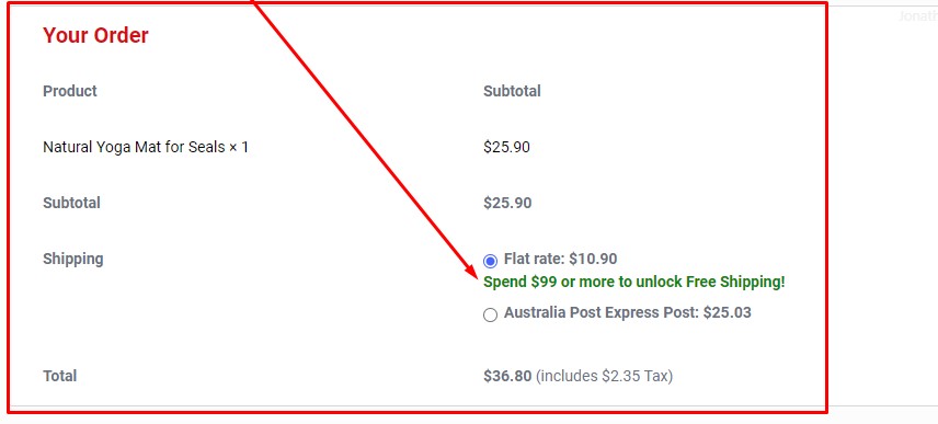
Here’s a neat trick if you offer free shipping under certain conditions.
You can use a Code Snippet to show a message under some shipping method if they have not yet reached the condition for Free Shipping within the Shipping method selection area.
Example:

Here’s the code snippet, which you’ll add using the Code Snippets plugin:
add_action( 'woocommerce_after_shipping_rate', 'snug_shipping_method_message' );

function snug_shipping_method_message( $method ) {
   if ( $method->id === 'free_shipping:2' ) {
      echo '<p>Put you message here. HTML is allowed too.</p>';
   }
}
(replace ‘free_shipping:2’ to whatever your shipping value is, typically found in inspector)
This works best if you then Hide the non-free shipping method when free becomes available… ie. with another code snippet like this:
add_filter( 'woocommerce_package_rates', 'snug_hide_shipping_method_when_free_is_available', 9999, 2 );

function snug_hide_shipping_method_when_free_is_available( $rates, $package ) {
if ( isset( $rates['free_shipping:2'] ) ) {
unset( $rates['flat_rate:1'] );
}
return $rates;
}
(replace ‘free_shipping:2’ and ‘flate-rate:1″ to whatever your shipping values are, typically found in inspector)
If you need to hide all of shipping methods when free is available, you’ll easily find a code snippet for that if you know basic Google-fu.
Make Free shipping more obvious
It could help to show the shopper that free shipping has been acheived as soon as possible. Perhaps just make the Free Shipping “stand out” a bit more.
Example:

This can be done with CSS targetting that specirfic “label”.
label[for="shipping_method_0_free_shipping2"] {
  font-weight: bold;
  color: green !important;
  font-size: 20px !important;
}
(find your label in Inspector)
Picking and Packing/Large item or Extra Fees
If any Product is going to attract any extra fees other than Shipping, advise the customer about these on the product page itself. A suprise Extra Fee at checkout is a huge turn-off!
Flexible Payment Options
Limited payment methods force customers to abandon their cart if their preferred option isn’t available. Provide flexibility and choice:
Accept Major Credit Cards
At the very minimum, your checkout should accept Visa, Mastercard, American Express and Discover to cater to preferences.
Offer Digital Wallets
Integrate with payment services like PayPal, Apple Pay and Google Pay to streamline the process for customers.
Buy Now Pay Later
Allow Services like Afterpay, let customers pay in instalments, lowering the barrier to purchase for shoppers on a tight budget.
Snug Site recommends Stripe as a Payment Gateway, and the Free Payment Plugins for Stripe WooCommerce plugin.
Design for Sales
Optimise for Mobile
Over 50% of web traffic now comes from mobile devices. An e-commerce site that’s not mobile-friendly will tank your conversions. Follow these mobile optimisation tips:
Use a Responsive Design
Don’t rely on a separate mobile version. Design your site using Elementor Pro, and ensure that you have looked over the Tablet, and Mobile views, and make adjustments if needed to ensure excellent usability on smaller devices (Build in desktop, then adjust in Tablet mode, and then in Mobile mode).
More information about that here: https://elementor.com/help/mobile-editing/
And a longer video guide:
Streamline Forms for Thumbs
Mobile form fields should be large and properly spaced to prevent mistyped info. Enable autofill and autocomplete wherever possible.
Minimise Page Weight
Optimise images and reduce any unnecessary code to make your pages load fast on mobile connections.
Check out our “Recommended Backend WordPress Plugins Article” for some Image optimisation and caching plugins.
Psychology Triggers & Peace of Mind
You can reduce cart abandonment by tapping into certain psychological principles that trigger feelings of scarcity, trust and ownership over the purchase:
Scarcity Marketing
Display low stock notifications, time-limited discounts or other messages that trigger FOMO and a sense of urgency to complete the purchase.
If you put “Only 1 left in stock!” then you are more likely to sell it. Just be aware that you should nurture brand affinity over time, and a customer might feel duped if they notice the stock number not reducing after purchase.
Build Trust With Social Proof
Customer reviews, free return policies and other trust signals help overcome buyer hesitation right before purchase. A short and sweet testimonial above or below the Checkout page could be a good place to start.
Use Product Visualisation
Invest in quality product imagery and incorporate augmented reality so shoppers can better visualise how a product looks and imagine themselves using it.
Exit-Intent Pop-ups
Deploy exit-intent pop-ups with discounts or free shipping offers to stop abandoners before they bounce. This incentive may seal the deal.
Elementor Pro can do Exit Intent Popups: https://elementor.com/academy/create-an-exit-intent-popup-in-wordpress-with-a-content-upgrade-offer/
Live Chat Assistance
Provide a live chat option so shoppers can get questions answered in real-time without leaving your site.
Final Thoughts
The key is creating a seamless, intuitive checkout experience optimised for mobile that builds trust and eliminates points of friction. Be upfront about all costs, provide flexible payment options, and streamline the checkout flow.
Leverage psychological principles like scarcity signals and product visualisation to increase commitment. And adapt your approach for shoppers using carts as wish lists, for entertainment, or for price tracking.
With an optimised user experience catering to different motivations, and credibility-building tactics like price guarantees, you can turn abandoned carts into completed purchases.
Prioritise prevention over Recovery.


